April 02, 2020
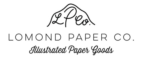
New Mini Logo
I have been designing a NEW wee logo for Lomond Paper Co. for a while and I have finally found something I like. I never really liked the Lomond Paper Co. in the round circle as I thought it wasn't distinctive enough or very me. This design encompasses the initials of LPCo. underneath the outline of Ben Lomond which stands on Loch Lomond. I hope you like it x


